Showing posts with label Versamark. Show all posts

Sunday, 8 March 2009

February ATCs- Friends


I love to try variations on a theme for my 3 for 3 swap ATCs each month, and this month I was playing with Versamark resist, Blending Blox and brayering, and metal embossed in the Cuttlebug. I am also trying to use up old stash! The Papermania flowers were bought the year they came out, and I have given them a new look by embossing and shaping them. Expect to see more of the same- they came in a big pack! Now I just need to find a new look for my enormous box of metal-rimmed tags...

Colour: Distress Inks, Dee Greunig's Blending Blox, Whispers back ink, Stazon, Paint Dabber, Sakura glaze pen, black fineline pen
Stamps: Kathy Davies (flower), Crafty Individuals (words and flourish)
Other: Drinks can metal, Papermania metal flowers, seed beads, glossy card

Sunday, 15 February 2009

A Tag for a Forum Friend


I made this tag for a forum friend for her birthday, and on the day of her birthday I was delighted to receive a really gorgeous piece of mail art from her, using 'three in a round' from Stampotique, which is such a cool stamp. If I get permission to blog it, I will! This tag uses lots of Cosmic Shimmer powder, so you will need to squint at it and imagine the gorgeous interference mica effects it really has!

Colour: Distress inks, Cosmic Shimmer powders, Sharpies, Versamagic, Stazon, Brilliance, Liberon Gilt wax
Stamps: Tanda (feather) and Studio g (alphabet)
Other: Beads, fibre, metal corner, acetate, slide-mount, eyelet and wire, all from my stash.

The feather in the slide-mount is stamped twice; once with Stazon, then with Versamark brushed with Cosmic Shimmer. When I put the two images, I offset them slightly so that you see the shimmer behind the dark feather.

Tuesday, 10 February 2009

Altered Domino Swap, plus mini-tutorial


This month's Altered Art swap on UK Stampers had the theme of dominoes. We each altered a domino, then incorporated it into a piece of work of our choice. I like this approach, as everyone has a different way of treating their domino. The pieces were all so different and gorgeous. See the slideshow here. My piece is a stamp book holder, and I have done a mini-tutorial for it (scroll down the page to see it). I call it mini because I didn't have time or a second pair of hands to be able to take any photos. First, the how-to of the decoration :)

Colour: Watercolour crayons/water-spray/drinking straw technique shown by Jo Capper-Sandon in Craft Stamper, Versafine, Versamagic, Distress Ink
Stamps: Stampin' Up, Crafty Individuals (postmark)
Other: Mountboard, old book pages, stamps (from a package sent to me by Marina from Cherry Pie), domino (the stamps are collaged on with beeswax using my Melt Pot).


My piece uses such simple techniques to construct it that I wanted to share them. I first came across the mitre trick when Tricia Morris showed it on Craft TV Weekly, which is sadly no more. I have used this technique before, to make a box file, and for the covers of my two circle journals. The trick is to treat your object as if it were a book, with two covers and a spine. I am giving the dimensions I used for this piece, but any variation will work.

What you will need:
Mountboard or greyboard
Cover paper and liner paper
Wet glue- I use white PVA
Something to spread the glue evenly- a foam brush or credit card is ideal
Ruler and pencil
Bonefolder

1. First of all, you need to decide your size and cut your mountboard pieces. My main pieces were: front 5cm x 8.5cm, base 3cm x 8.5cm, back 7cm x 8.5cm. I did not cut my sides or base at this point, as I wanted a really snug fit.
2. Work out the dimensions for your cover paper. Widthways is easy, as it needs to be 2cm bigger on each side than the mountboard. Lengthways, you will need to allow an extra 0.5cm each side of the spine for the piece to fold, plus 2cm each end. So my finished cover paper was 12.5cm wide x 20cm long. Decorate it, remembering that it is a wrap-around and the design needs to be multi-directional.
3. Mark your 2cm border on the back of the paper. Spread glue evenly on the mountboard pieces and glue down, making sure that they all line up at the top and bottom, and that you leave your 0.5cm gutters either side of the small spine piece.
4. Using your ruler as a spacer, draw a line across each corner of the cover paper, approx. 3mm from the corner of the cover, and at approx 45 degrees (you can do it by eye, it's OK to guess!) Cut along these lines.
5. Now we are going to fold in the long edges of our cover paper. First fold your flaps up without glue, to make a crease (just to make it easier to fold when covered in wet, sticky glue). Spread your glue along the first flap, making sure you get it right up to the edge of the mountboard. Lift up the whole piece, and press the edge against your work surface as you wrap your flap as tightly as possible around the mountboard (if you just use your fingers it won't be as even). You will know this is right if you can still see the shape of the mountboard- the paper shouldn't look domed. Repeat for the other side. Work the joints, smoothing the cover paper gently down into the gutters.
6. This next part is slightly fiddly. When you look at the corners of your piece, you will see that the cover paper overhangs the mountboard by 0.3cm on the long side. You need to use your bonefolder to tuck this excess around the corner and flatten it out. Do this on all four corners. Now you have a nice flat flap to fold up and glue, exactly like you did for the long sides, and when it is glued you will have a professional-looking mitre with no unsightly points.
7. Cut your liner paper 0.5cm smaller all round than your finished piece is (mine was 11.5cm x 19cm). Brush on your glue and, starting from the spine, smooth the liner down onto your piece, gently pushing the paper down into the gutters again. Now work the joins, and smooth it down anywhere it pops up, adding extra glue if necessary. Your covers are done!
8. To add sides and a base, simply measure your finished piece and cut your mountboard to fit. My sides have a slanted top edge, and my base is bigger by 0.5cm all round. Be aware that your cover paper will add bulk, so err on the smaller side when cutting. Add glue on three edges of the side pieces, and hold in position until the glue starts to set- with PVA this doesn't take long. Glue the base on, and leave the whole piece to dry overnight, using weights, clips or elastic bands if necessary to make a tight joint.

I hope this makes sense to you! If do you have any queries, please feel free to email me and ask- my email is on my profile. And if you make something using these instructions, link back to this post and I will come and admire your work!

Saturday, 7 February 2009

Faux sea-glass no. 2

This is yet another present for a friend, and spookily, the day I handed it over, it co-ordinated with what she was wearing!

Colour: Dee Greunig blending blox, distress inks, versamark, Perfect Pearls, Paint Dabbers
Stamps: Elusive Images
Other: Stampbord, UTEE, Crop-a-dile.

Tuesday, 30 December 2008

Stampbord necklace- two techniques!

After I got my lovely new Melt Pot, the first thing I did was go onto Youtube to look for tutorials. I was delighted to find loads from Suze Weinberg herself! This necklace was inspired by a tutorial of hers, showing paper beads dipped in UTEE (different from the Leandra bead which uses lots of layers of UTEE), and another tutorial by Suze Weinberg with Julia Andrus, author of 'Paper Transformed', which showed a way of making faux sea-glass. I used the sea-glass technique to make the pendant, but used Stampbord instead of glass as the base- it still looks good to me! The beads were made using the Melt Pot, but I have in the past used Glossy Accents instead of UTEE, which worked as well but was more time consuming. I love these two techniques, and you will be seeing them again!

Here's Faux Sea Glass:


And here's the UTEE bead:

Thursday, 21 August 2008

Glenda's Stampbord Challenge


I am a regular reader of Glenda Waterworth's blog (as so many are- it's number 9 on the Crafty Blogs listings site) and recently she set a challenge with the chance to win some gorgeous new stamps. Those who stop by regularly will know that my current favourite stamps are the Elusive Images words set with all those fab quotes- I have used them for most of my recent projects! I also have a couple more sets, and a wood mounted mandala stamp, which I haven't used since last Christmas. Well, to stop the rambling, Glenda's challenge is to produce something using Elusive Images stamps plus Stampbord, and this is it- a star ornament for my Christmas tree! I haven't had time to look at the other entries, but I am sure they are all beautiful and inspiring. As soon as I have finished this, I'm off to admire!

Colour: Glimmer mist, Dee Gruenig Blending Blox, Paint Dabber, Sakura Stardust pen, Ranger Stickles, Cosmic shimmer embossing powder, Versafine, Versamark
Stamps: Elusive Images
Other: Shrink Plastic, acetate, Stampbord, ribbon and star eyelet from my stash.

The star itself is made by stamping the mandala onto acetate, heat embossing, then spraying three times with Glimmer Mist, leaving it to dry each time. Then I cut it into six triangles, flipped it over, and re-arranged it as the star. I did this twice, and layered them back-to-back. The front Stampbord is a Versamark resist, and the back is heat embossed before colouring, to get a stronger image.

Thanks for the challenge, Glenda, I really enjoyed making this!

Sunday, 17 August 2008

UK Stampers are doing Sunday challenges!


I know there are a lot of challenges out there, but it never hurts to have another choice! UK Stampers is now doing a challenge each Sunday, and the challenge is being set by Efemera, otherwise known as Gail, whose work you will have seen in last month's Craft Stamper. We have done two challenges so far. The first was to make something with your oldest and newest stamps. I used the bright card I made for my friend Vicky as the example of my newest stamps (those Inkadinkado flowers), and the top photo here is what I made with my oldest stamp, the Personal Impressions snowflake. I bought it in 1998, and used it originally to make that year's Christmas cards, before putting it away and forgetting about it. Using it again, on the triptych ATC, made me realise how pretty it is, and I may even use it this year for my cards!
The second challenge was to make two Oriental-themed tags, one in colour and one black and white. I found this really challenging, as I don't really 'do' oriental, even though I have a gorgeous set from Non Sequitur. I started by making some stamped paper, then I got so inspired by it that I made a little origami box! (The design for this is from CraftTV Weekly, although I made it smaller this time. Here is the last one I made) I then remembered to make the tags, and I quite like them. I think the black and white one is better, and my Husband likes the red. You decide!

Colour: ATC- alcohol inks, Stazon, silver embossing powder, Tags- Distress Inks, Vivid inks (to colour paper), Brilliance, Perfect Pearls (brushed on and made into a paint), watercolour pencils
Stamps: ATC- Personal Impressions, Non Sequitur, Tags- Non Sequitur, Judikins
Other: Japanese paper, free origami paper downloads from Canon, red card, gold card.

The kimonos were created by paper piecing, using the origami designs. The origami downloads were printed out at half size, so that the proportion was correct for the kimonos, and the Japanese paper was embossed with clear embossing powder to make it go transparent to give the look of a screen.

Saturday, 6 October 2007

Perfect Pearls class for 2 peas Stamptoberfest.


I don't know if you remember, but 2Peas' stamping board staged a very successful weekend event called World Stamping Weekend. Well, this time you have a week to get involved and have some fun! There are loads of challenges and classes, and this is one of them.

In this class, I am going to demonstrate my three favourite techniques using Perfect Pearls. The challenge part for you is to use all of those techniques on one piece! The RAK for the best piece is a bag of ribbons and embellishments which I promise to photograph tomorrow! Judging will take place next Saturday, and all entries must be in the 2Peas gallery and have SOF Pearls in the title. Here is the thread to link to. Click on any of the photos for a closer look!

Note: I have used Perfect Pearls here. From what I have read, the difference between PP and other powders is that PP contains a gum that acts as a fixative. So if you are using other brands, just remember to use a spray fixative or varnish.

Stage one- Creating a background.

This is the Craft mat/ Distress Ink technique with a little added Perfect Pearls. You could also use Nick Bantock Dye Ink in the same way. Or feel free to play with whatever you have! Be warned, this technique is messy and you will get inky fingers. It’s all in a days stamping!

You will need:

Distress Ink or other dye ink (not water resistant!)

Perfect Pearls

Craft mat, cutting mat or other plastic surface

Water in a spray mister

Small paintbrush

Smooth watercolour paper or card

  1. On your craft mat (or other plastic surface) dab your ink pad(s) randomly, leaving some gaps. Make sure the area you cover is a little bigger than your chosen paper.
  2. Use a dry paintbrush to get a little powder and flick it over the inked craft mat. I like to have a few little ‘drifts’, to give a more obvious effect.
  3. Spritz your craft mat with water until there are tiny even beads of water/ink visible.
  4. Place your paper on the wet, inky mat, and move it around a little. Lift the edge and check the coverage. If there are any gaps, then put it down again and move it around some more.
  5. Put the paper to one side to dry. You can use a heat gun if you are impatient!

Now for the next part…

Stage two- adding pattern

This is a really simple stage (isn’t it all?!) to add some pattern to your background paper. You will need to make sure your paper is really dry, as the powder will cling to any moisture.

You will need:

Versamark

Perfect Pearls

A small paintbrush

A soft brush ie. a blusher brush, or a dry tissue/cotton wool.

A stamp with a swirl-type pattern

  1. Ink up your chosen stamp with Versamark
  2. Stamp it onto your background paper to create a pattern.
  3. Using the small paintbrush, generously dust on some Perfect Pearls. You can use more than one colour and blend if you like. If you swirl the brush around as you go, you can move the powder along the design so as not to waste it.
  4. Blow off the excess powder.
  5. Using either the soft brush or a piece of tissue, gently rub all over the design to take off any unwanted powder. This also sets and polishes the powder.

And now for the last part…

Stage three- Adding your design

This last stage utilises something I found out by accident, and creates a two-tone effect.

You will need:

Distress Ink or similar in a darker colour

Perfect Pearls

A small paintbrush

A soft brush or tissue/cotton wool

A stamp!

  1. Stamp your design in Distress Ink or other.
  2. When it is nearly dry, add some powder. Swirl it around with your brush, it doesn’t have to be really even.
  3. Brush off as in stage two.


And this is the finished piece... All stamps by Cherry Pie.

Thursday, 6 September 2007

Isa's Alpha Challenge- J

This week has been a bit of a struggle for me, time-wise, so I am very happy to be able to post this card at last! Isa is back from her Summer holiday, and she has put her challenges onto a new blog. You can see the button for it on my sidebar, with the Wednesday Stamper and TMTA buttons. I like Isa's challenges, as the only real rule is that you need to use a word on your entry that begins with the alphabet letter of the week. Then there are a couple more options which you can choose to use, or not. I tend to try all of the options, as I like a real challenge!
This weeks letter is J, with the extra options of using a bright yellow and making a Christmas card. As you can see, I have done all three. I couldn't think of another word other than Joy, but Christmas is not the season to get all funky for me, I love it in all of its traditional glory!
The stamped panel is a yellow metallic watercolour background, stamped with the Hero Arts script in Distress Ink Vintage photo, and the Hero Arts harlequin background in Versamark, then brushed with Perfect Pearls. The other panel is an image transfer of a K and Co Christmas paper, transferred using Matt Medium onto gold Mirri card. Then both the panels were edged with Versamark and gold embossing powder. The letters for the word 'Joy' were changed to gold with my new Sakura Pen Touch pen (the budget alternative to a Krylon pen), then distressed by touching it whilst still wet. I did the same to the stars. The cardstock is Bazzill.
As usual, you can't really see the overall effect in a photo. Doing an image transfer over a bright gold card gives a real depth to the translucent image, rather like the gold backing on costume gems. And many thanks to Julie and Carrie, who have both done photo step-by-steps on their blogs. This time I found it easy, and only made a couple of holes in the image with my fingernails as they are quite long! The tip I really liked was to use a baby wipe to take off the backing paper, I found it much easier than a wet fingertip (and much safer, as no jar of water waiting to be knocked over!)
PS I was really surprised and delighted to find that my Wednesday Stamper entry for last week is on the Sampler. Thanks so much, Wednesday Stamper!

Thursday, 30 August 2007

Wednesday Stamper- Blue


This week's Wednesday Stamper theme is blue, which is one of my favourite colours, and I immediately knew what I wanted to do. Well, this is almost what I had planned. This is a new stamp from Non Sequitur, and I was planning to get complicated and heat emboss, watercolour, and generally phaff about. I stamped the image first of all, to check how much pressure I needed etc (this is a huge stamp!) and... I love it plain! It almost feels like cheating, to just stamp an image in one colour, but how could I improve on the beautiful design. If you click on it you will see there are loads of tiny dots, it is very detailed.
I did mess around with the background, it is the usual craft mat/water technique, only this time I sprinkled on some Perfect Pearls before spritzing with water. It has created drifts of subtle shimmer, a bit like a clouded sky in the moonlight.
Sadly my camera is not too happy with blue tones, and every photo I took came out turquoise! The actual card is a much darker blue. I found that if I tilt my laptop screen away from me, the colour is perfect!
The swirl stamps are also Non Sequitur, the silvery ones are stamped with Versamark and brushed with Perfect Pearls. The main image is matted onto some pearlescent and plain cardstocks, and I added a navy blue ribbon. Oh, and the stamping and background were done with Nick Bantock Dye Ink in Prussian Blue, just like my hands last night!

Thursday, 9 August 2007

More Backgrounds, but this time that's all that's required!

I realise that I keep on showing backgrounds at the moment, but this time there is a good reason! I'm taking part in a 3 stage ATC jam at UK Stampers, where three people each do part of an ATC, then send it to the next person etc. (A bit like a circle journal). We've only just started, and so these are my two background, to be sent on to the next person on the list. The next time you see these, they will be unrecognisable!
For these, I used the craft mat/water technique with Nick Bantock Dye Inks in Prussian Blue and Chartreuse Green. Then I stamped in Versamark and brushed with Perfect Pearls. The Blue background is an Anna Griffin stamp with Gold Perfect Pearls, and the green background is a two Non Sequitur stamps with Copper Perfect Pearls. I know these are techniques I use a lot, but I thought it best not to be too experimental when someone else needs to be able to work on these!
I have just received some backgrounds to work on, and they are fab. I need to get my thinking cap on, as I want to do these right! We have three weeks to work on each stage but are ahead of ourselves already. I will work on them this weekend, if I get some time. This stage is quite difficult, as I have to leave room for the last person to contribute.
I have got more photos to show, but tomorrow, as they are for a birthday! I am still out and about making the most of this lovely weather, so the photos are building up a bit, waiting for a big hit!

Thursday, 2 August 2007

Think Monday, Think ATC- Loving couples

This week's Think Monday, Think ATC challenge is 'loving couples'. How could I not use this stamp? The original of this is beautiful, but Marina from Cherry Pie has really caught the passion in her rendition for this stamp. Thanks Marina!
The border and text were computer generated, the main image was stamped in black Versafine. The Cherry Pie heart was reverse stamped in Versamark, using the flat plain square from Judikins' 'Carol's Cube' (ink up your stamp, stamp it onto the square, then stamp the square onto your paper. Voila, your image is reversed!). First it was heat embossed with gold detail powder, then I used Versacolour Cardinal Red direct-to-paper over the whole image, poured on clear embossing powder, then heated it. I don't know how this works, but the original embossing comes through the colour! Then I cut out the heart and glued it in position, and mounted the whole thing on black card. Oh, and the lips were coloured with Sakura Stardust then Glaze pens.
If anyone loves fonts, as I do, then check out Dafont.com. There are hundreds of amazing fonts in all different styles, perfect for the finishing touch for your projects. And they're free!

Sunday, 29 July 2007

New header.

As you can see, I have finally got around to making a few little changes on here, just little tweaks to make it a bit nicer. This is partly thanks to Godelieve, as she has a blog devoted to helping us novices with improving on the original template.
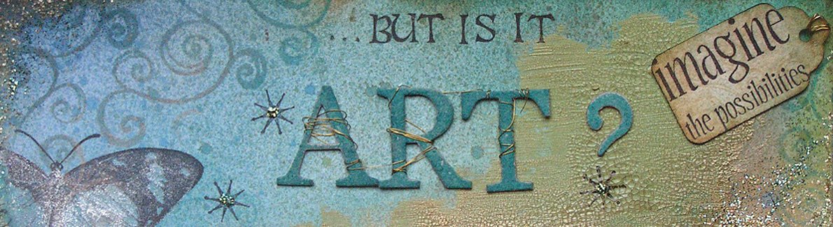
I've been planning this header for ages, I have just been so busy with other projects that I kept putting off making it. I wanted to use all of my favourite stamps and techniques, to reflect the general content here. So, stamp-wise, you will see my Cherry Pie and Aud Design swirls, Hero Arts script, PSX alphabet, Cherry Pie face and a butterfly stamp (Rubbadubadoo). The background was made using the craft mat/water technique and Distress Ink in Dusty Concord plus Nick Bantock Dye Ink in Damson Plum. All of the black stamping was done using Versafine, and the golds were either Perfect Pearls on Versamark or Gold heat embossing on acetate. The chipboard letters are from Making Memories and were coloured with Brilliance Inks, the gold swirl is 7Gypsies, and the flower is Prima.
Oh, and if anyone is interested, the name of this blog is from an ATC I did for one of Isa's challenges, which said "I like it...but is it Art?" It refers to the interesting question for stampers, that since we are using someone else's images, is it art? Or maybe it should be "Whose art is it anyway?"

Sunday, 22 July 2007

UK Stamper's 'Artistic License' ATC swap part two


Here are the other two ATCs for the Uk Stampers swap. Instructions for them are on a post from a couple of days ago. The only difference with these is that the top one has gold Krylon pen on the reverse of the acetate.
I had thought I was so up to date this month, then looked at the date! These are due for the 26th, and the Jacob's Ladder swap is for the end of this month! I had better get stamping!

Friday, 20 July 2007

Think Monday, Think ATC- Asia


I've been pondering this theme since Monday, trying to decide how to use my oriental stamps, as I don't have a lot to choose from. It's strange, as I love Japanese culture and I have some nice items around the house. Maybe that's why I don't have many stamps of that theme, I would want them to be beautiful and not at all cartoonish. I have my eye on some from Stonehouse Stamps, but have yet to take the plunge and order them.
The penny finally dropped that Asia also incorporates India, and suddenly I was inspired! The peacock is India's national bird, and I have used some text from a Hindu folk tale. And I love pink!
I stamped the main images (both from Tanda Stamps) in Versamark on cream card, and used matt clear embossing powder before creating my background with H2os and other metallic watercolors. Then I masked off the image and stamped the background with the feathers image (Rubbadubadoo) using Cats Eye Fluid Chalk in Dark Peony. The text was tinted with Distress Inks in Tattered Rose and Antique Linen, then the Paisley (Tanda Stamps) stamped and embossed in gold.
I feel the need to find some detail embossing powder in various colours, as the paisleys look a bit 'rough', but good old Google will surely help me!

Wednesday, 18 July 2007

UK Stamper's 'Artistic License' ATC swap

I'm late posting today, as Wednesday is busy day! I've been out and about, doing baby things, since 10am, and only now, at 9pm, am sitting down with time to myself. It's still better than work, though, and at least it motivates me to make better use of my free time. So it's stamping time in a minute, while my Husband cooks dinner, yum yum!
This is the first of three ATCs for the UK Stampers July swap. It has been jinxed at every stage, but here it is, finished! I'm going to carefully put it away in a minute, just in case something else happens! I wrote about the Sakura pens problem, next I couldn't get the word 'Art' to stamp (on the rough side of the acetate), so had to cut out the original image and glue it onto a second piece of acetate, then the Perfect Pearls I used in the background decided to stick to the rough side of the acetate too! At least the photo isn't too bad, although the background stamping is more vivid in real life.
All of the stamps are by Cherry Pie, I stamped in Black Stazon then coloured with Sakura Souffle and Stardust pens, and the background was stamped in Versamark then dusted with Perfect Pearls. The acetate was adhered with glue dots hidden under the gems and the figure.
I have two more still to finish, then I need to think about some other projects. I wonder what the new theme is for Wednesday Stamper?
PS Thanks to Penny for the idea of using the Souffle pen behind acetate for the face. I have used the Stardust and Glaze on acetate before, but hadn't thought of trying the Souffle as it is Opaque.

Sunday, 8 July 2007

My first project with the Bind-it-all.


Here is some artwork, at last! This project took three evenings, but there was a lot of work in it! I was inspired to make this for my Husband by the Making Memories 'Poolside' chipboard alphabet which forms the 4 solid pages of this book. There are also 4 clear plastic pages, thanks to two old Sizzix embossing folders which I didn't need for their original purpose. These have the popped-out letters attached to them. It has made a really chunky book; I had to use the 1" binding wires.
First I made two co-ordinating papers to cover the chipboard with. I used the Nick Bantock dye inks as my starting point, and used the usual craft-mat/water spritzer technique I have used on previous backgrounds. One used the Prussian Blue and Cerulean Azure, the other also used the Chartreuse Green. I stamped over these with various oriental stamps from Blade Rubber and Paperartsy, plus my favourite Cherry Pie swirls. I added accents with Versamark and Perfect Pearls.
The front of the chipboard pages were inked with the Prussian blue ink and covered with the green paper, then the letters cut out with a craft knife. I sanded the edges then used gold Krylon pen to finish them off. I did the same in reverse with the popped out letters, using the turquoise paper. The reverse of these was inked with the two blue inks, stamped with Versamark and the swirls stamp, then Perfect Pearls added.
Then I punched the pages! This was easy, although I had to line the pages up carefully because I only wanted to use five holes instead of six. The machine had no problems going through the chipboard or plastic. I laid the plastic pages over the chipboard pages and glued on the letters with glossy accents, with the right side to the plastic.
The covers were easy, just two pieces of mountboard cut to size, then covered with the turquoise paper. On the front cover I also attached the cut out green paper letters from the inside pages, then added ribbon and a shrink plastic dragon embellishment and a Chinese jade charm. I used navy cardstock on the reverse after adding the ribbon, to cover the raw edges. I then punched the covers, finding it a little difficult to get through the extra two layers of ribbon, but achievable with a bit of extra pressure.
The binding was the easies part, just set the machine and pull the handle. I only have white wires at the moment, but I will be adding to my collection. Oh and one last thing before I assembled the book: I sprayed everything with Matt artists varnish, as my fingers were covered in blue ink from handling the pages. Not good for a present!
I'm very lucky that my Husband appreciates these creations, this book has no purpose other than to look pretty- oh, and keep me occupied for three evenings!

Friday, 22 June 2007

More backgrounds, or How I can't Move Forward!


I have 3 projects underway at the moment: Wednesday Stamper, the theme for which is 'Eggs', UK Stampers' June 'Buttons and Bows' ATCs, and a mini-book swap on UK Stampers. All of these projects are stuck at the background stage! I have an idea of where I want to end up with each, but I don't seem able to put stamp to paper. I think it's because DH is away. Although he doesn't stamp, I often talk through my ideas with him. Sometimes just the act of verbalising my thoughts makes up my mind, otherwise it's nice to have an opinion, even when I disagree with it! So Sunday is going to have to be an active stamping day, to make the most of him before he goes off again.
The first background here is for the June ATCs. I pasted down some images printed from the computer, painted gesso over them, then scraped most of it off with a credit card. Its a nice way to 'grunge' up your stamping surface. The second background is an ATC for Wednesday Stamper, and I used part of the Nick Bantock Ink background I made a couple of days ago. I stamped in Versamark with an Anna Griffin clear damask stamp, then dusted Perfect Pearls over. It is quite shimmery in real life.
I won't be posting again until Sunday, as I am going to my Brother's wedding tomorrow. But Sunday morning I will have photos of a little project I made as a gift for the happy couple!
Don't forget Worldwide Stamping Weekend over on 2 Peas this weekend. The schedule is out, so clear the decks and get ready to play!

Monday, 18 June 2007

A Big First.


This Father's Day was particularly special for my Husband, as it was his first! Sadly, we didn't plan anything much as he had to pack for a trip away with work, and had to leave in the afternoon, but he got coffee in bed, and a lot of play time with Dan! I have actually got something planned for him, but my lips are sealed as he may still get around to reading this in the next couple of weeks while he is busy.
I saw the sentiment on this card as a stamp for Mother's Day, but knew then that I had to use it for Father's Day, as 'Danny and Daddy' time is all about smiles and laughter (Mummy time is all about eating and sleeping, boring!). I had planned to use more colour, but in the end I chose black and white because I thought it would be more punchy.
The capital letters are Papermania foam stamps, the curly letters are an MSE clear alphabet, and the small letters are my trusty PSX alphabet. I used Versamark to stamp the background with the Cherry Pie Klimt swirls, then used white embossing powder for the words. The photo was re-sized, adjusted to black and white and the words added in Paint Shop Pro, then the brad and the ribbon added. I stopped there, as Paul rightly says I add too much 'stuff' to my work, and don't know when to stop! At least he is honest enough to tell the truth!

Friday, 15 June 2007

First of four...

I have four Father's day cards to make this year, 2 Fathers-in-law, my Dad, and my Husband! It is my husband's first father's day, although last year I made him a card and got him a pressie as I was half way through my pregnancy. This time it's for real, and I need to make him something really fab.
This card is for my Husband's Dad, and I can safely show the photo as he is on a lovely holiday at Lake Garda in Italy. The other cards will have to be posted after Sunday, as the recipients do try to keep up with the blog. Hi family!
For the background I patted Distress Inks in Scattered Straw, Antique Linen, and Vintage photo onto a plastic mat, spritzed it with water, and rubbed my white cardstock into it. The images are from Hero Arts and Rubbadubado, stamped in Vintage Photo Distress Ink. The dark cardstock is stamped using Versamark with the Hero Arts stamp. All of the metal embellishments are 7Gypsies, the 'Family' tag is Pebbles inc.
It was nice to be stamping and get messy after the much cleaner scrapbooking!