Showing posts with label Crackle Accents. Show all posts

Tuesday, 31 March 2009

Hannah's Pink CJ- Queen of He-ART-s


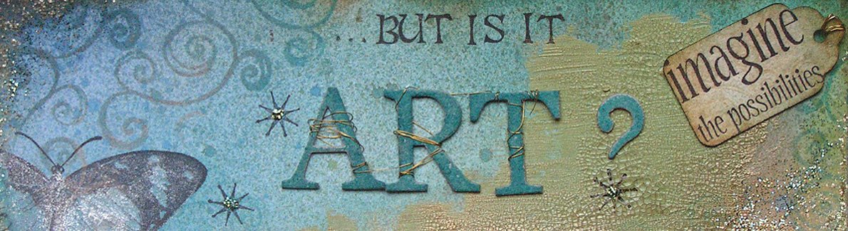
Here is another entry for our UK Stampers' 'Colours' CJ. This is Hannah's lovely little pink book, and for once I decided to stamp directly onto the page, as the page colour was so delicious! I love pink, but don't use it in my work as much as I used to, despite having lots of yummy paper in that colour. Must remember to use it more often...

Colour: Dee Greunig Blending Blox (again!), Distress Ink, Glimmer Mist, Sharpies, Stickles, Versafine, Stazon
Stamps: Elusive Images (small 'art'), Limited Edition, unknown 'A-R-T' signing stamps, Tim Holtz (Grunge Alpha)
Other: Playing card, border punch/fancy scissors (used to create paper lace), cardstock-weight vellum for corner, Ranger Crackle Accents (used on A-R-T)

Thursday, 26 February 2009

Altered Tin- Inspired by Van Gogh


This tin was for a swap on Zuzu's forum, and I was over a week late sending it because I had one of those last-minute ideas that complicated the project but I had to do it! Typical me! Originally, I was just going to decorate the outside of the tin and prettify the inside, but then I realised that the tin was the perfect size to fit slide-mounts (I have rather a lot of these, bought years ago and never used!). So I decorated the slide-mounts and joined them together to make a wallhanging.

Colour: Versamagic, Sharpies, watercolour crayons, Brilliance, Aurora ep, gilt wax, Distress Inks, Vivid Inks, Cosmic Shimmer powders, Barry M eyeshadow powders
Stamps: Paperartsy, Studio g alphabet, ISC butterfly
Other: Crackle Accents, Gesso, Galleria moulding paste, heavy florist's wire, bead, twig, metal from coke can, plastic slide mounts

The tin originally contained saffron, and had the pink flowers as part of the original decoration. I was inspired by a Van Gogh painting and was trying to capture the swirly effect of the background. The three slide-mounts all have Van Gogh paintings in. To capture the vibrancy of the originals I printed each painting on paper and on transparency- when you lay the transparency over the paper print, suddenly the image comes alive.
PS Plastic slide mounts do not like being heated with a heat gun....!
PPS I realise that many of the mediums I used are not supposed to be used on metal, but it's amazing what a few light coats of spray varnish enable you to do!

Friday, 5 September 2008

4" x 4" page and charm


Someone I know from UK Stampers has been very sick, in hospital, for some months. She became ill with a very rare disease (not cancer) a few months into our CJ, and has only just reached the point of having one short day out of hospital. She has a very good friend, Sarah, who has organised a way of us stampers saying 'we miss you- get well soon', which is a charm bracelet with each of us making a charm, plus a 4" x 4" page which will show her who made which charm. I am not a jewelry maker, although I love playing with shrink plastic, and I definitely love working on 4" x 4" pages!

Colour: Glimmer Mists, Distress Inks, Perfect Pearls, Brilliance Inks, copper embossing powder, Stickles, Moonshadow Mist, Paint Dabbers
Stamps: Elusive Images
Other: Caught in crystal background (click on the word in my label cloud for more on this), acetate, old book page, florist's wire, Papermania jewelled brad, Sizzix tag die, Crackle Accents, Cuttlebug embossing folder, semi-precious gemstone beads (sorry, I have forgotten what they are!), jewelry findings, shrink plastic.

The panel on the top of the page is inspired by Arts and Crafts ceramics, and the Cuttlebug panel is my version of faux aged copper. It looks even better in real life!

The original inspiration for this charm project is here
. Scroll down the page and you will find it near the end. What a great idea; Thank you.

Monday, 18 August 2008

July's altered art swap- matchbox shrine


This is my first ever shrine, and I loved it. I have always loved working in miniature, so this was an ideal challenge for me. I was inspired by Japanese inro, little boxes that were tucked into a kimono's sash as a pocket. The first one I made was a bit costume-y, and I didn't like it (after spending a lot of time on it, of course!). This is my second attempt, and I managed to put into it the essence of what I admire about Japanese art, while still retaining my own style.

Colour: Versafine, Sparkle and Sprinkle embossing powder, gold Krylon pen
Stamps: Non Sequitur (ginkgo leaf), unknown (crane)
Other: Japanese newspaper, origami paper, gold cord, Ranger Crackle Accents, gold card

The bead is a paper bead, made from the newspaper, and the crane inside was made from a 1" square of the newspaper. If you like origami, check this site out for great tutorials!

Wednesday, 16 July 2008

July's ATCs- Metal


With this month's theme, I was initially excited, as I could use my favourite technique with the metal foil/Cuttlebug/Paint Dabbers, but then I was stumped! In the end, I made up the metal pieces, then coloured the ATCs, and just stared at them for an hour. My dear husband had recently bought me a set of sentiments stamps from Elusive Images (not the usual verses, but much more interesting), and I realised that three of the verses were not only appropriate, but the right size! Whoever gets these ATCs will think I had been drinking, though, as the stamp I use on the back for my details is upside down; I changed my mind about which way they looked best after making them (obviously before putting the verse on LOL!). Whoops!
The bottom photo is a close-up of the effect on the metal- bling, bling!

Colour: Distress Inks, Paint Dabbers, Glimmer Mist, Moonshadow Mist, Versamagic (on vellum)
Stamps: Elusive Images (verses), Crafty Individuals, Inkadinkado, Cherry Pie
Other: Vellum, Metal tape, Prima flowers, heart punch, old book page, Ranger crackle accents

Wednesday, 20 February 2008

Happy Birthday, Jill!


This card is quite exciting for me, as it is the first card for ages that I have made which didn't involve colouring in and cutting out. It was like eating pie and mash after a month of gourmet meals; a total comfort! I do love all of the complicated things, but actually, I also love the simple style, too. And this was simple to make, even though there are lots of elements. This is the first card I have blogged which uses Stampin' Up stamps: this set is 'Carte Postale', and I need to say thank you to Lorna and Cliff, my Parents-in-Law (who live in France) as I bought these stamps with the money they sent for my birthday.

Stamps: 'Carte Postal' from SU (background, sentiment, tile), Hero Arts (script stamp used on flower etc)
Colour: Versafine in Vintage Sepia
Paper: Plain card embossed with Cuttlebug folder
Embellishments: Embelliscrap swirls and heart, Prima flower, Making Memories brass label holder, ribbon from my stash
Other: Ranger Crackle accents used on tile and sentiment. I highlighted the cracks using Distress Ink in Vintage Photo. Effective, eh?

I completed my scrap page last night, and I think it's one of the best I have done for ages. I always acheive a lot when I go to Vicky's to scrap, and she always does when she comes to me. I think that if you are leaving your craft room to go elsewhere, you put more thought into a project and therefore have done more of the hard work of planning before you start. So we are going to try to alternate who goes to whom, and then I'll at least have a decent finished page every other time I scrap! I'll show you last night's page later...