Showing posts with label Glossy accents. Show all posts

Tuesday, 10 March 2009

Next photos- Domino Jewelry


This was for yet another swap- it's rare at the moment that I do anything which isn't for a swap! I really enjoyed making these, and think I will make some more at some point.

Colour: Domino 1- Sharpies, Stazon, Clear UTEE, Moonglow ep, Stickles (on heart charm) Domino 2- Stazon, Gold and copper ep
Stamp: Rubbadubado
Other: Plastic dominoes, ribbon (on back, not shown), florist's wire (to make loops for necklace), waxed linen thread (for dangle on brooch), jewelry findings, Glossy Accents

Friday, 26 December 2008

All of my Christmas cards

This is all of the cards sent this year (minus a couple I forgot to photograph). The stamps are all Paperartsy and Cherry Pie, and I used all of my favourite products and techniques on them. Thanks for looking!

Sunday, 10 August 2008

A Present For a Friend- Part 1 of 3


I have had a couple of weeks of making presents for friends, luckily the ones who appreciate hand-stamped. This is a little wallhanging for a friend, and I sent it late as I didn't want to send any old stamped thing! All three of these pressies use the same Elusive Images sayings stamps- I can't stop using them!

Colour: Distress Inks, Glimmer Mist, Perfect Pearls, Paint Dabbers, Versafine
Stamps: Tanda, Paperartsy, Elusive Images
Other: Mountboard, metal tape, acetate, piece from necklace, leather thong, silk dupion, Glossy Accents

The shimmer on the stamping was created by swirling Perfect Pearls onto an image stamped with Distress Ink- not when it's too wet, but before it dries. The beads were made using long thin triangles of the silk, wetting them with Glossy Accents, then winding them tightly around a cocktail stick- exactly like making paper beads.

I will try to blog all of the other projects I have been making soon- I have such a backlog of photos as I have been too busy creating!

Tuesday, 12 February 2008

Two Months' Worth of CJs in One Post!


As usual, I have been doing and photographing, but not blogging. Life is busy, blah, blah, blah, I'm sure you've heard it all before. So I thought I would show two months' worth of CJs together, as a sort of catch-up.
The stamp for the first journal was the clock stamp. Now, the clock paper I have used for the background is one of the first scrapbooking papers I ever bought. It's K and Co, from one of their 6" x 6" books. I have stopped buying paper's en masses, as I have loads left, but for once I knew this one was the one to go with the stamp. The quote is by Virgil, and means "but it flees, irreplaceable time flees", otherwise known as "Tempus fugit". Very appropriate for many of us! The dragonfly is Non Sequitur, painted with H20s and with glossy accents over the body, and the wings are Fantasy film. The clock face is covered in crackle accents, but it doesn't show up in the photo. I had the idea that the dragonfly was flying off, holding the clock.
The second journal came with the legs. Everyone before me was inspired in a humourous way, so I had to do my bit. Anyone that doesn't get it, look at 'bingo' on Wikipedia, particularly English bingo calling. Well, I thought it was funny!
I have a couple of cards which I will try to blog later, both Magnolia, and one made in a class which I took on Friday with Isabelle Norris. I have to go and do the housework now, real life isn't always fun... ;-)

Thursday, 29 November 2007

Cards for Babies.


Has it really been three weeks since I last checked in? As you can see, I have been busy. As well as making all of the cards, I have been to lots of baby parties, and held our own for my little one year old. Happy birthday to them all! The last of the parties was today, and although they were fun they were also exhausting! Babies, cake and toys equal noise and grizzly little ones after a couple of hours. And I'm sure it only gets worse as they get older!
As you can see from the photos, I have a couple of new toys. First of all, I have some new stamps, the fairy is from Wendie Rhodes and the boy with the balloon is Magnolia (the other two Magnolia stamps were kindly sent to me by Kym, thanks so much, Kym!). Then my lovely husband bought me a Cuttlebug for Christmas, and said I could have it now, bless him! Other than those, I have used H20s for all of the colouring in, and stamps from Stampendous, Aud Design and Forth Dimension. There's also a little Glossy Accents, Brilliance and Sakura glaze pens thrown in for good measure.
I found it interesting doing these cards. The colouring in was really good fun, but the designs were hard to do! I think grunge is much more my usual style, but I will have to get good at these cutie things too! Wish me luck!
PS I owe a couple of Ladies a RAK over on 2Peas. I haven't forgotten, just didn't make the time to organise it! Will sort this weekend.

Tuesday, 28 August 2007

Scrapping some photos!


I have taken so many photos over the last year or so, and every time I download them onto my laptop I think "That will make a great layout!". Of course, I tend to spend my craft time stamping, as I just love playing with inks, but I have finally bitten the bullet and done a page. And there is stamping on here, honestly!
This page is in the 8 1/2 x 11" landscape format, to go in my new Papermania album. The cardstock is Bazzil, and the patterned papers are Junkitz and Basic Grey. The chipboard letters are Making Memories, painted with orange acrylic paint then stamped with my Judikins circles cube. I had to paint over the stamping with a couple of coats of acrylic, then I added Glossy Accents to make the balls effect. The metal letter brads were black inside the letters, I used a Sakura Stardust pen to go over the black, and used a punched heart over a 'v' (I figured it wouldn't be missed!). Anything else was from my stash, which I really have to use before I get anything new!
I enjoyed doing this layout. I have always struggled a bit with 12" x 12", as it is not an instinctive shape to design around. After all, most magazines, books, and paintings are rectangular! I can see myself doing some more pages soon, I have got a whole album to fill!

Monday, 16 July 2007

Isa's weekly challenge- 'I'


Isa's challenge this week, as well as the usual alphabet theme, is to use something transparent and to use stitching. This is my entry, which I am quite pleased with, although I don't usually do sparkly. Maybe I should also enter this for UK Stampers' 'Cute v. arty' challenge, as this is a bit outside my usual style. Maybe I'm not quite comfortable with it because I only used three stamps!
The inside of the card is a wash of watercolour paints, some sparkly, over stamped and embossed in white with my well-used Stampendous stamp. The outside of the card was stamped at the top using A Stamp in the Hand's 'Field of Sky', one of those useful stamps, then embossed with holographic sparkle powder and over washed with sparkly watercolours.
It all happens on the acetate wrap on the outside. I stamped and embossed the Anita's dragonfly in white, then cut the same shape out of Art Institute's Fantasy Film in Aurora and glued it behind with Glossy accents. Then I did a separate dragonfly, this time embossing in holographic sparkle then cutting out the glued layers and mounting it over the first dragonfly, again with glossy accents. I pricked then stitched the word 'Iridescent' with sparkly floss and glued on the flower sequins with Sakura quickie glue. To attach the wrap to the card I ran a line of the quickie glue down the spine of the card, then weighted the edge to make sure it dried in position.
I think I need to start using more sketches for my cards, as this one uses the same basic layout as two others I have done this year! Funny how you are always drawn to a layout you are comfortable with! Oh well, off to 2Peas to look at sketches!

Sunday, 8 July 2007

My first project with the Bind-it-all.


Here is some artwork, at last! This project took three evenings, but there was a lot of work in it! I was inspired to make this for my Husband by the Making Memories 'Poolside' chipboard alphabet which forms the 4 solid pages of this book. There are also 4 clear plastic pages, thanks to two old Sizzix embossing folders which I didn't need for their original purpose. These have the popped-out letters attached to them. It has made a really chunky book; I had to use the 1" binding wires.
First I made two co-ordinating papers to cover the chipboard with. I used the Nick Bantock dye inks as my starting point, and used the usual craft-mat/water spritzer technique I have used on previous backgrounds. One used the Prussian Blue and Cerulean Azure, the other also used the Chartreuse Green. I stamped over these with various oriental stamps from Blade Rubber and Paperartsy, plus my favourite Cherry Pie swirls. I added accents with Versamark and Perfect Pearls.
The front of the chipboard pages were inked with the Prussian blue ink and covered with the green paper, then the letters cut out with a craft knife. I sanded the edges then used gold Krylon pen to finish them off. I did the same in reverse with the popped out letters, using the turquoise paper. The reverse of these was inked with the two blue inks, stamped with Versamark and the swirls stamp, then Perfect Pearls added.
Then I punched the pages! This was easy, although I had to line the pages up carefully because I only wanted to use five holes instead of six. The machine had no problems going through the chipboard or plastic. I laid the plastic pages over the chipboard pages and glued on the letters with glossy accents, with the right side to the plastic.
The covers were easy, just two pieces of mountboard cut to size, then covered with the turquoise paper. On the front cover I also attached the cut out green paper letters from the inside pages, then added ribbon and a shrink plastic dragon embellishment and a Chinese jade charm. I used navy cardstock on the reverse after adding the ribbon, to cover the raw edges. I then punched the covers, finding it a little difficult to get through the extra two layers of ribbon, but achievable with a bit of extra pressure.
The binding was the easies part, just set the machine and pull the handle. I only have white wires at the moment, but I will be adding to my collection. Oh and one last thing before I assembled the book: I sprayed everything with Matt artists varnish, as my fingers were covered in blue ink from handling the pages. Not good for a present!
I'm very lucky that my Husband appreciates these creations, this book has no purpose other than to look pretty- oh, and keep me occupied for three evenings!

Saturday, 2 June 2007

The Naming Day is over...


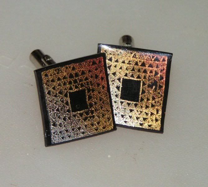
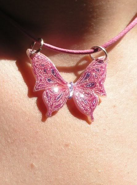
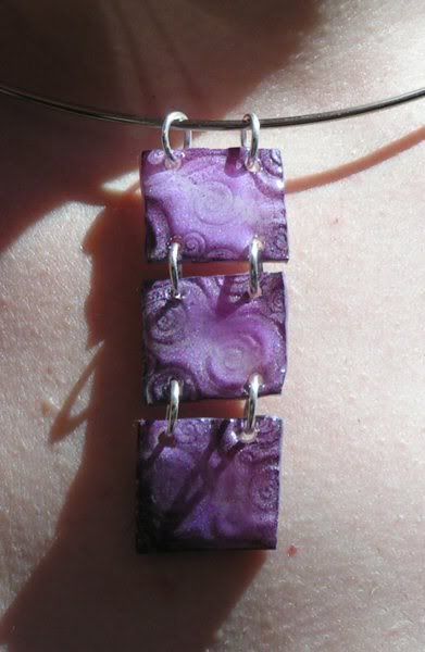
... and I can post pictures of the jewelry I made as presents. They were all done with shrink plastic and Ranger glossy accents, two of my favourite products to play with. The butterfly necklace was made for my 4 year old niece, as she took part in the ceremony, and was a stamped image from Fourth Dimension, coloured with Sakura Stardust pens and shrunk. The cufflinks were presents for the Godfathers, my Brother and Brother-in-law, and were made using a stamp from Cherry Pie, stamped in Brilliance mineral trio on black shrink plastic (there were two sets!). The other necklace was for the baby's godmother, my friend and crafting buddy, and was made by dabbing brilliance in pearlescent purple, crimson and moonlight white onto transluscent shrink plastic, then stamping into the shrunk square whilst still hot with another stamp from Cherry Pie. All of the pieces were given a layer of glossy accents, to protect the images and to add some dimension.
If anyone is in doubt over having a traditional christening, I would definitely recommend a Naming Ceremony as a great alternative, it was quite a day! And the best thing is that I have photos and messages for the baby which I can now make into a lovely star book!