Showing posts with label Hero Arts. Show all posts

Thursday, 12 March 2009

Stampbord brooch swap


Sid is hosting a Stampbord brooch swap at UK Stampers, and I was hit by inspiration for this one! I had been using my melt pot for another piece I have made (yes, for yet another swap!) and to use up the excess UTEE I poured it into some of my Krafty Lady Art Moulds. I loved the heart so much that it inspired the rest of the piece.

Colour: Dee Greunig Blending Blox (green), Stazon, Versafine, Gilt wax, Opals UTEE
Stamp: Hero Arts script
Other: Small Puffy Heart art mould, Grungeboard wings, Cuttlebug script embossing folder, Aurora Fusible Film, Stampbord, brooch pin, Pinflair glue gel

The colour of this is changeable, as I started with the Blending Blox before gluing and ironing on torn strips of Fantasy film. The wings were bent and glued on with a supporting blob of the Pinflair glue gel- my new favourite glue!

Tuesday, 27 January 2009

Mum's Birthday Card


When I started to make this, I told Vicky that I wouldn't blog it as I wasn't too happy with how it was going. Actually, I felt in the end that it came together pretty well, so here it is!

Colour: Dee Greunig Blending boxes, Sharpies, Iridescent Medium, Versafine
Stamps: Magenta, Elusive Images, Field of Sky, Hero Arts
Other: Bazzil Bling card, brayer
Posted by Picasa

Wednesday, 20 February 2008

Happy Birthday, Jill!


This card is quite exciting for me, as it is the first card for ages that I have made which didn't involve colouring in and cutting out. It was like eating pie and mash after a month of gourmet meals; a total comfort! I do love all of the complicated things, but actually, I also love the simple style, too. And this was simple to make, even though there are lots of elements. This is the first card I have blogged which uses Stampin' Up stamps: this set is 'Carte Postale', and I need to say thank you to Lorna and Cliff, my Parents-in-Law (who live in France) as I bought these stamps with the money they sent for my birthday.

Stamps: 'Carte Postal' from SU (background, sentiment, tile), Hero Arts (script stamp used on flower etc)
Colour: Versafine in Vintage Sepia
Paper: Plain card embossed with Cuttlebug folder
Embellishments: Embelliscrap swirls and heart, Prima flower, Making Memories brass label holder, ribbon from my stash
Other: Ranger Crackle accents used on tile and sentiment. I highlighted the cracks using Distress Ink in Vintage Photo. Effective, eh?

I completed my scrap page last night, and I think it's one of the best I have done for ages. I always acheive a lot when I go to Vicky's to scrap, and she always does when she comes to me. I think that if you are leaving your craft room to go elsewhere, you put more thought into a project and therefore have done more of the hard work of planning before you start. So we are going to try to alternate who goes to whom, and then I'll at least have a decent finished page every other time I scrap! I'll show you last night's page later...

Wednesday, 13 February 2008

Two Magnolia Cards- Updated.


Sorry guys, cards now, chat later. Gotta dash!

Well, that was a hectic week, in the end. I'm finally having a rest as it's Sunday morning. Dan is happily playing with his toys and books, and I'm watching a classic Dr. Who, with Tom Baker as the doctor. Bliss.
The two cards are both made with Magnolia stamps. The top one was inspired by an Ismaki sketch, although I didn't finish it in time to post the link properly. The second card was made at a class I took with Isa Norris, and uses the new Magnolia horse stamp, which I love. It also uses a technique I have been interested in for a while, the 'Magic colouring Pencil' technique. It involves using Prismacolour pencils, which are beautifully soft wax pencils, and blending them using odorless mineral spirits, in this case Sansodor. The effect is lovely, the colours just 'pop'. I won't be investing in these pencils, as they are pretty expensive (and addictive- you *need* all of the sets LOL!) but I really enjoyed having the chance of playing with them. I also feel I was a bit more daring than usual with layering up the background papers- note the asymmetry, very unusual for me!

Papers: English Paper Company, unknown
Stamps: Magnolia, Hero Arts, Paperartsy
Colour: H20s, Prismacolor pencils, Distress Inks, Versafine, India Ink
Chipboard: Maya Road (flower), Sizzlit die (corner swirl)
Flowers: Prima

Wednesday, 12 September 2007

TMTA- Slide Mounts

I actually made this on Monday night, but I wanted to upload Isa's challenge first, so here is my entry for this week's Think Monday, Think ATC. This week's challenge is to use a slide mount somewhere on your work, and I have these lovely card ones which are great for stamping on.
I was thinking of Isa's Alpha challenge when I made this, although it has nothing to do with the letter 'K', but I am inspired by the idea of black and white plus one other colour. I had also watched a demo with Glenda Waterworth from Elusive Images on TV where she did layers of 'spotlight stamping', with the colour on the second and, in her case, third layer.
The main stamp is Anna Griffin, stamped in Versafine on white cardstock. The spotlighted area is the same stamp used with Brilliance Orchid Pink. The slide mount is stamped (Hero Arts) and distressed using Stazon, as it has a glossy finish. The black butterfly is stamped in Versafine, the pink in Brilliance with added Stickles glitter glue. Thanks for looking!

Thursday, 6 September 2007

Isa's Alpha Challenge- J

This week has been a bit of a struggle for me, time-wise, so I am very happy to be able to post this card at last! Isa is back from her Summer holiday, and she has put her challenges onto a new blog. You can see the button for it on my sidebar, with the Wednesday Stamper and TMTA buttons. I like Isa's challenges, as the only real rule is that you need to use a word on your entry that begins with the alphabet letter of the week. Then there are a couple more options which you can choose to use, or not. I tend to try all of the options, as I like a real challenge!
This weeks letter is J, with the extra options of using a bright yellow and making a Christmas card. As you can see, I have done all three. I couldn't think of another word other than Joy, but Christmas is not the season to get all funky for me, I love it in all of its traditional glory!
The stamped panel is a yellow metallic watercolour background, stamped with the Hero Arts script in Distress Ink Vintage photo, and the Hero Arts harlequin background in Versamark, then brushed with Perfect Pearls. The other panel is an image transfer of a K and Co Christmas paper, transferred using Matt Medium onto gold Mirri card. Then both the panels were edged with Versamark and gold embossing powder. The letters for the word 'Joy' were changed to gold with my new Sakura Pen Touch pen (the budget alternative to a Krylon pen), then distressed by touching it whilst still wet. I did the same to the stars. The cardstock is Bazzill.
As usual, you can't really see the overall effect in a photo. Doing an image transfer over a bright gold card gives a real depth to the translucent image, rather like the gold backing on costume gems. And many thanks to Julie and Carrie, who have both done photo step-by-steps on their blogs. This time I found it easy, and only made a couple of holes in the image with my fingernails as they are quite long! The tip I really liked was to use a baby wipe to take off the backing paper, I found it much easier than a wet fingertip (and much safer, as no jar of water waiting to be knocked over!)
PS I was really surprised and delighted to find that my Wednesday Stamper entry for last week is on the Sampler. Thanks so much, Wednesday Stamper!
Tuesday, 7 August 2007

Thanks to Godelieve.


This is another of my half-done projects, but when I am time-challenged I do tend to just do a small project rather than a whole card or page. Last night was not a sleeping night for Dan, so whilst Paul was cooking, I decide to decorate some Maya Road chipboard flowers.
The story behind this is that a few months ago, Godelieve showed a project using the Windsor and Newton Iridescent medium. I looked for it at the time with no joy, and then forgot about it. It gives a finish a little bit like H20 paints, and you can either mix it in or paint it over your painted project. Well, I went shopping to a huge place which stocks a lot of basic craft and art equipment (plus loads of homeware, it's a tempting shop!), and there it was, on the shelf!
Naturally, I had to have it, and last night it was sitting on the table when I got downstairs. Godelieve has also recently decorated some chipboard flowers, the ones from Maya Road which I have had for nearly two years and hadn't used. So I thought: iridescent medium, Godelieve, flowers, and this is the result! I used a mix of Brilliance and Versamagic inks, plus a little Distress Ink, stamped with my Hero Arts script stamp, then over-washed with the Iridescent Medium. I am planning to use them on a card, I have an idea in mind, but let's hope Dan sleeps this evening!

Monday, 6 August 2007

My first commission!


I realise I have been absent from blog-land all weekend. The weather has been too good to be indoors, although I did get some creative time yesterday evening. This card was made for a busy friend to send to her Mum for her birthday. This friend is very creative too, but her baby sleeps even more badly than Dan, so takes up a lot of evening time. It's no fun trying to be productive if you have had no sleep!
I started by doing the craft mat/water technique using Distress Inks in Shabby Shutters, Antique Linen, and Scattered Straw. Then I sprayed with Perfect Pearls mixed with water, and stamped with A Stamp in the Hand's Field of Sky over the whole thing (it looks like a sprayed finish, without the uncertainty!). I stamped with Hero Arts script, Aud Design's swirl, and a Paperartsy butterfly over the background, then edged with Nick Bantock Dye Ink in Damson Plum. I stamped the main Paperartsy image in Damson Plum, and while it was wet dusted Perfect Pearls over it. The card it is matted onto is also Damson Plum Ink and Perfect Pearls. It looks so shimmery in the light! The main card is stamped with the script stamp in DI Antique Linen, then I stuck it all down with added ribbon and an embellishment from my stash.
I should have taken a photo of the envelope and the insert, as I stamped on those using Ancient Page in Sandalwood, as it is waterproof. Next time I will. I hope there will be a next time, anyone want a card?!

Sunday, 29 July 2007

New header.

As you can see, I have finally got around to making a few little changes on here, just little tweaks to make it a bit nicer. This is partly thanks to Godelieve, as she has a blog devoted to helping us novices with improving on the original template.
I've been planning this header for ages, I have just been so busy with other projects that I kept putting off making it. I wanted to use all of my favourite stamps and techniques, to reflect the general content here. So, stamp-wise, you will see my Cherry Pie and Aud Design swirls, Hero Arts script, PSX alphabet, Cherry Pie face and a butterfly stamp (Rubbadubadoo). The background was made using the craft mat/water technique and Distress Ink in Dusty Concord plus Nick Bantock Dye Ink in Damson Plum. All of the black stamping was done using Versafine, and the golds were either Perfect Pearls on Versamark or Gold heat embossing on acetate. The chipboard letters are from Making Memories and were coloured with Brilliance Inks, the gold swirl is 7Gypsies, and the flower is Prima.
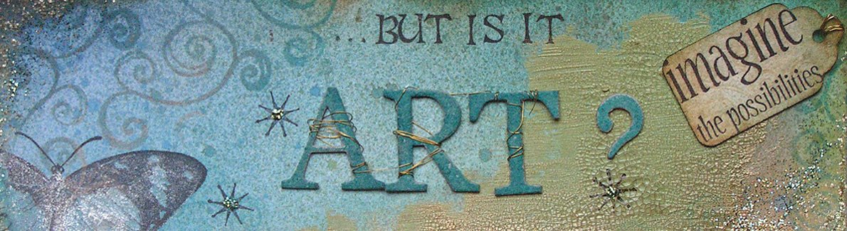
Oh, and if anyone is interested, the name of this blog is from an ATC I did for one of Isa's challenges, which said "I like it...but is it Art?" It refers to the interesting question for stampers, that since we are using someone else's images, is it art? Or maybe it should be "Whose art is it anyway?"

Saturday, 28 July 2007

Think Monday, Think ATC- Holiday

I finally managed to finish my ATC for this week's Think Monday, Think ATC challenge. Boy, did I struggle with this one! I hope it's just because of this cold I have, but I really wasn't inspired, and this isn't my best work. However, I have decided to use it, even though I don't like it, as I am not ashamed to show I have off days! The important thing is to recognise when something isn't quite right. It would be far worse if I thought this was amazing!
Anyway, the faux postcard in the background was made with my Hero Arts script stamp, a Rubbadubadoo butterfly stamp, and Distress Ink in Vintage photo. Then there is a layer of torn Mulberry paper, then a photo of a French beach printed onto a transparency. Finally, a swirl stamp from Aud Design was stamped in black Stazon and highlighted with white pen, and I wrote "Wish you were here" to finish. Hmmm, not sure where I was going with this!

Friday, 13 July 2007

Think Monday, Think ATC- Faces.

I decided last night that, despite the presence downstairs of the wakeful baby, I would leave him under the supervision of his Daddy, and go into the dining room to stamp. I was getting withdrawal symptoms! I wanted to make something small, and so decided to go for it, and make something for the new challenge site, Think Monday, Think ATC. This week's challenge is faces, and so I have used my gorgeous new Limited Edition stamps, plus some old favourites.
I stamped the frame first, in Versafine, and masked it off before stamping the Hero Arts script. Then I did a reverse mask and stamped the Cherry Pie face. I watercoloured everything using Distress Inks in Shabby Shutters, Scattered Straw, Tattered Rose, and Weathered wood. I stamped on the Prima flowers (with the new stamps), and attached them with brads from my stash.
For me, that's pretty simple, and I got it finished just as Dan started to be ready for sleep!

Thursday, 5 July 2007

Finally I can show the photos!


Kym has now received this so I can stop teasing and show the finished book! This is my contribution to UK Stampers Velvet-ize swap. It's a bit hard to work out how this book works, until you follow the instructions and make it. It is a 6" square book when closed, but it has two front covers which sit one on top of the other, so that when they are open the book is 18" wide. The inside pages also fold on top of each other, and have fold out flaps, whew, it does sound complicated! Luckily the instructions from Craft TV Weekly are excellent, so it was pretty easy to put together.
The details of how I made the background paper are on a previous post here, and the instructions for the book are here at Craft TV Weekly (you will need to join to download the PDF, but it's free). To embellish, I firstly used a sponge and Distress Ink in Dusty Concord to add colour around the edges of the covers, inside and outside. I made tags and a pocket for them inside the covers, and printed off the quotation on vellum, which is inside the chipboard frame. The flowers are also sponged with Dusty Concord Distress Ink. The paper on the back of the inside pages is from K and Co, sponged again. There are several slide mounts, coloured and stamped to match, then the rest of the embellishments are from Dovecraft (chipboard), Prima (flowers) and Making memories (all of the metal items). All of the ribbon is from my stash.The spaces are for Kym to add photos or vintage images, whatever she likes really!
I loved making this book, although it was a little nerve-wracking to make for someone else, especially someone whose work I really like! I am now planning to make one for my Husband as a delayed birthday present, and fill it with photos of him with the baby. I will show it when it's done!

Friday, 29 June 2007

Thank you, Brayergirl! Great class!


I went back into 2 Peas' World Stamping Weekend's list of classes to start to catch up on what I missed last weekend, and as mentioned in a previous post, I did Kristy's background class. The first photo today is of the resulting creation. Kristy's class has all of the details, but to cut a long story short, you start with the 'faux batik' technique to create some white areas, add your colourwash, which I did using the craft mat/Distress Inks technique, then use a couple of complimentary colours and stamps to create your printed background. What fun! I needed to make two large pieces of paper, English size A2, so I worked on my biggest craft mat, and with some fairly large stamps. My final touch was to add a spritz of perfect pearls mixed with water, in a spray bottle, which Isa and Julie both talk about on their blogs; it adds a beautiful, subtle shimmer. Stamps used are Hero Arts and Aud Design, inks are Distress Inks in Weathered Wood, Milled Lavender, Antique Linen and Tattered Rose. (Again!)
The second two photos are of the mini-book I have made with the background paper. It is for the UK Stamper's Vevet-ize swap. I am not going to post it until Saturday, because of the postal strike today, and I'm not going to show photos of the whole book until it has been received! I want it to be a bit of a surprise for Kym. I hope she likes it! I am due to receive a book from Sid, which I am really pleased about as I love his work. In fact, I would have been happy to receive a book from anyone on the list, they are a talented bunch! All of the photos will go onto the UK Stampers cyberblog, I will post the link when they are ready to be viewed.
I won't be stamping this evening, as my Husband is back from a second week away from home, and I have a surprise planned for him. It's a secret and I've managed to keep it from him for three weeks! Shhh!

Friday, 15 June 2007

First of four...

I have four Father's day cards to make this year, 2 Fathers-in-law, my Dad, and my Husband! It is my husband's first father's day, although last year I made him a card and got him a pressie as I was half way through my pregnancy. This time it's for real, and I need to make him something really fab.
This card is for my Husband's Dad, and I can safely show the photo as he is on a lovely holiday at Lake Garda in Italy. The other cards will have to be posted after Sunday, as the recipients do try to keep up with the blog. Hi family!
For the background I patted Distress Inks in Scattered Straw, Antique Linen, and Vintage photo onto a plastic mat, spritzed it with water, and rubbed my white cardstock into it. The images are from Hero Arts and Rubbadubado, stamped in Vintage Photo Distress Ink. The dark cardstock is stamped using Versamark with the Hero Arts stamp. All of the metal embellishments are 7Gypsies, the 'Family' tag is Pebbles inc.
It was nice to be stamping and get messy after the much cleaner scrapbooking!

Thursday, 7 June 2007

Black and white inchies.

Anyone involved in this swap, look away now! These are for a swap on UK Stampers with the theme of 'black and white'. I made the background as one piece, then cut it into the individual 2.5cm square pieces. When it was done, it made me think about the illustrations in fairy stories, I'm not quite sure why! Hence the fairy-tale inspired words, and the theme of the embellishments. I suppose inspiration comes from very individual memories and emotions, you just hope someone else will understand where you're coming from. Or at least like the results, yes, I'll settle for that!
Background stamps from Hero Arts, Tandastamps, and Aud design. Words printed from the computer. Now I just have to wait to receive my swaps!

Monday, 4 June 2007

Paris mini (name badge) album


This is what I was working on last night, the Name badge album challenge from UK Stampers. Basically, it is a really small mini album, 8.5cm wide by 5.5cm deep, using security badges from a stationers as page protectors. The original, from Craft TV Weekly, used slightly bigger pockets, but this was all I could find on the high street. I have chosen the theme of my favourite places in Paris, and I'm using photos from my visit in 2004, for my tenth wedding anniversary.
As you can see, the first pair of pages is of Notre Dame de Paris. Our hotel was in the Quartier Latin, and each morning we took our croissants, crossed over the river Seine, and ate them in front of the cathedral. Lovely memories!
Enough of the reminiscences! The background papers were made using an 'aged newsprint' effect in Paint shop pro, then stamped with a script stamp from Hero Arts, and swirls by Aud Design. The brads are all Making Memories. I haven't scrapped for ages, as you see my style is 'cluttered' as I love embellishing!

I have used some of my lovely caught in crystal background, but I know that trying to photograph acetate in artificial light just doesn't work, so I will post the photos tomorrow!